
Market

November 12, 2013
Interactive Graphing Tool & Tables
Written by John Packard
Our existing website is about as basic as one can get when it comes to housing our pricing and other data. The existing site has no ability to provide data in a graphic form and our tables are cumbersome and pretty low-tech. This is not the image we want to project as we build toward adding more data series. This is also not the image we want to project to those of you who need to interact with our data for your own reports and analysis.
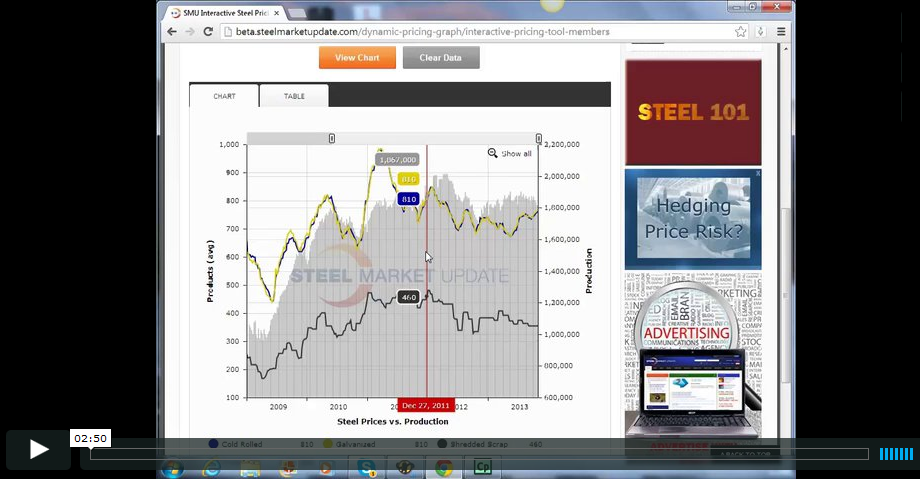
We wrote about our new “Interactive Graphing Tool” in an earlier issue, and we hope you had time to watch the demo video of it. Now we hope that you will take the time to actually play around with it and use in to your benefit. We are including the video tutorial again in this article. It is also found on the “Interactive Graphing Tool” page: http:// steelmarketupdate.com/dynamic-pricing-graph/interactive-pricing-tool-members. As we said before, this graphing tool is our “baby”. We felt our customers deserved better access to information – especially pricing information. So, we created our interactive graphing tool which is used in our steel and scrap pricing area as well as other areas of the website. It will give you the enhanced ability to manipulate various data sets, including all of all of our flat rolled steel and ferrous scrap prices. On the new website, you will be able to interact with pricing data all from a single graph. It is as easy as clicking your mouse a few times.
The “Interactive Graphing Tool” involves four key components: Products, Values, Views, and Extra Data. Using the graph, you can chose to show and compare as many products, values, views, or extra data as you like. You will simply select the number of product prices that you want to see, chose the high price, low price, or average price, and chose weekly or monthly prices. The “Interactive Graphing Tool” will generate a dynamic graphic based on your inputs. It will allow you to manipulate the time spans so that you can view pricing from a historical perspective all the way down to a single data point in time.
We are toying with new ways to compare data. So, when we first come online we will have a few items which can be superimposed on pricing data to provide a deeper view of the market. One of the data sets we will have available is our SMU Steel Buyers Sentiment Index. You will now be able to compare Sentiment to, for example, hot rolled coil average pricing over a period of time. You can then adjust the time series to fit your needs.
Behind the graphs are new tables and new ways to interact with our data tables. You mouse will let you know what we mean…
The Interactive Graphing Tool is used elsewhere around the site. Each membership level (including the public) will get a taste of these graphs and we hope you enjoy manipulating the time series based on your needs.
We encourage you to start using it, and we are certain that it will be one of your favorite features of the new site. Click on the image below to launch a demo tutorial of the “Interactive Graphing Tool”
The post Interactive Graphing Tool & Tables appeared first on Steel Market Update.